I recently came across a dataset listing the location of supermarket branches of pretty much every major UK retailer. The dataset itself can only be described as the result of remarkable human effort by some folks at Geolytix who put in a lot of dedication into the creation of this dataset (both on Google Street View and on actual streets).
Living in London myself, I limited the data to those supermarket branches located in the UK’s capital. So what does London’s retail landscape look like?
library(dplyr)
supermarkets %>%
  group_by(Retailer) %>%
  tally(sort = TRUE)
## Source: local data frame [10 x 2]
##
## Retailer n
## 1 Tesco 440
## 2 Sainsburys 295
## 3 Marks And Spencer 143
## 4 Waitrose 87
## 5 Lidl 64
## 6 Morrisons 52
## 7 Asda 33
## 8 Budgens 27
## 9 Aldi 17
## 10 Whole Foods 7
For now, I’ve decided to focus on the four biggest retailers.
topSupermarkets <- filter(supermarkets,
                          Retailer %in% c("Tesco", "Sainsburys", "Marks And Spencer", "Waitrose"))
Let’s have a look at what their geographical distribution looks like! All the maps below are created with ggplot2 in R. London’s boroughs and the River Thames are plotted as polygons. The data has been read in from shp-files (see here for example). Find the full code at github.
London’s boroughs and the River Thames as polygons. The data has been read in from shp-files (see here for example).

Tesco and Sainsbury’s obviously both aim to cover all areas of London (though Sainsbury’s has some apparent gaps in the very West and East of the city).
Of the two smaller chains Marks & Spencer still has a relatively even distribution across London. By contrast, Waitrose branches seem to show a relatively distinct J-shape.
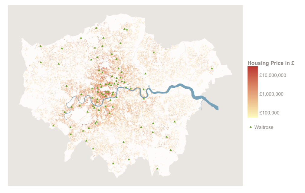
At this stage, my friend and colleague Stephen Law provided some invaluable input by pointing me to data on housing prices in London. I decided to take a closer look:

The similarities in the two patterns hard to deny. The J-shaped area between Hampstead Heath in the north and Richmond Park in the south features both London’s highest housing prices (the plotted data is from 2013, but previous years look almost identical) and a disproportionately high amount of Waitrose branches.
An interesting question is: What came first? The Waitrose branches or the high housing prices?
Waitrose’s price range is clearly above Tesco and Sainsbury’s, so the more intuitive answer is that Waitrose opened most of their branches in these areas to target the wealthier part of the population. Yet it’s also conceivable that at least to some extent the prevalence of Waitrose branches in certain areas have attracted wealthier people and, thus, indirectly raised housing prices in these areas. Unfortunately, the dataset provided by Geolytix doesn’t contain any data on the opening dates of the stores and I have been unable to find any consistent information online. Hence, I’m currently unable to test any of these speculations.
Nonetheless, the pattern itself is quite noteworthy and wraps up an interesting exercise in spatial visualisation with ggplot2 (as well as some data wrangling with dplyr).
To see the full code, head over to Github!
As a potential next step, I’m considering buidling a Shiny app that will allow users to interactively examine and compare the geographical patterns of different supermarket chains – as well as some other potentially related variables (e.g, social demographics).
